postcard, linda living

This was created as a handout for a health and wellness trade show and it makes the point that you may be eating healthfully, but may still be eating foods that are not tolerated well by your own unique system: not something most of us realize!
.
postcard, chris pennock
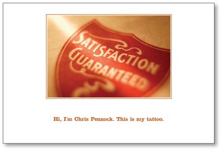
This insurance agent works mainly with those in the construction and trades industries.This postcard is direct and without frills and exudes an overall approachable informality and sense of humor, which is very much in keeping with this agent's unique brand.
postcard, ad-vantage marketing
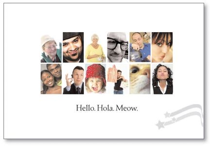
This postcard was designed for a direct mail company that has the capability to address each customer individually. Each postcard is addressed to speak to different customers in their own way of speaking.
postcard, davis carpets
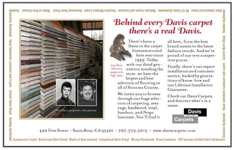
Postcard for a family-owned business who wanted to let everyone know they are very much a part of the local community. The owner grew up in the business; Lucy the dog made sure visitors felt right at home.
.
postcard, dk landscaping
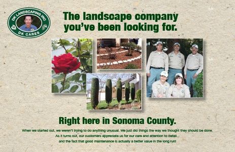
This landscaping company kept hearing that their level of professionalism was greatly desired but hard to find. This direct mail campaign let everyone know that they do exist, right here! This campaign helped DK Landscaping meet and achieve its marketing goals within six short months.
.
postcard, food stylist
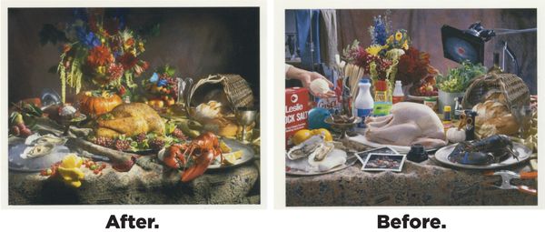
These are images from a postcard designed to showcase the talents of an expert food stylist by reversing the standard "before and after" comparison. Although the image on the left looks like an old masters' painting, both of these images are photos created specifically for this mailing. A very dramatic comparison!
.
Postcard, American Heart Association

An invite bearing the logo and identity created for the American Heart Association's annual Go Red for Women event. A sophisticated look was developed for this fundraiser's upscale target market and included a fashion show.
postcard, eric taggesell
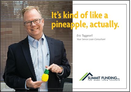
One postcard of a direct mail campaign addressed to existing customers of a home loan consultant. Eric's customers are already familiar with this person's easygoing and genial personality; this serves as a reminder that it may be time to have another chat and catch up on things.
.
postcard, hilton hotels
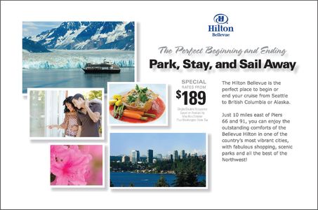
This was a campaign created for Hilton Bellevue to promote their vacation package specials. Each promotion was adapted for use on the Hilton website as well as part of their multi- channel marketing campaign.
.
postcard, hallmark gold crown
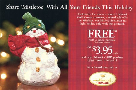
This postcard captures the warmth and emotional appeal that is Hallmark's brand, reflected in the engaging photography that brings the products to life.
.
postcard, xtraoak
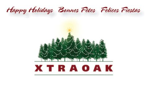
This was a holiday illustration created by dressing up this international company's logo. Most of the year, their advertising is very product-focused, but this is not the time of year for a hard sell, just a warm greeting of goodwill.
copyright 2022 © iceberg strategic creative tm all rights reserved
Powered by GoDaddy WEBSITE BUILDER
This website uses cookies.
We use cookies to analyze website traffic and optimize your website experience. By accepting our use of cookies, your data will be aggregated with all other user data.
